Design & Style
Color & Type
Studies have shown that the color orange has been used often to create a sense of energy, excitement, and creativity in UI Design.
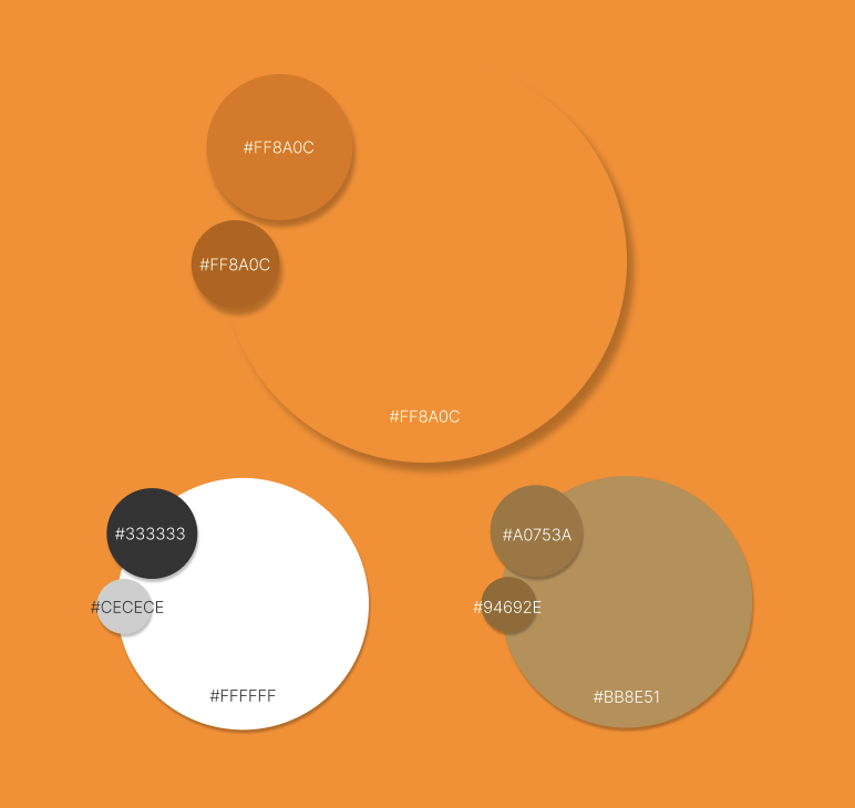
MarkIt.’s goal is to get users to USE the app. Even though grocery planning may be a stressful or dreaded activity, using this bright orange, MarkIt. aims to make the grocery planning process more fun and energetic. The orange is paired with a tan cardboard color mainly used in the logo and white and gray shades for neutral elements.
MarkIt. is designed to be easily digestible and consumable. Our goal is to inspire productivity without stressing out our user.
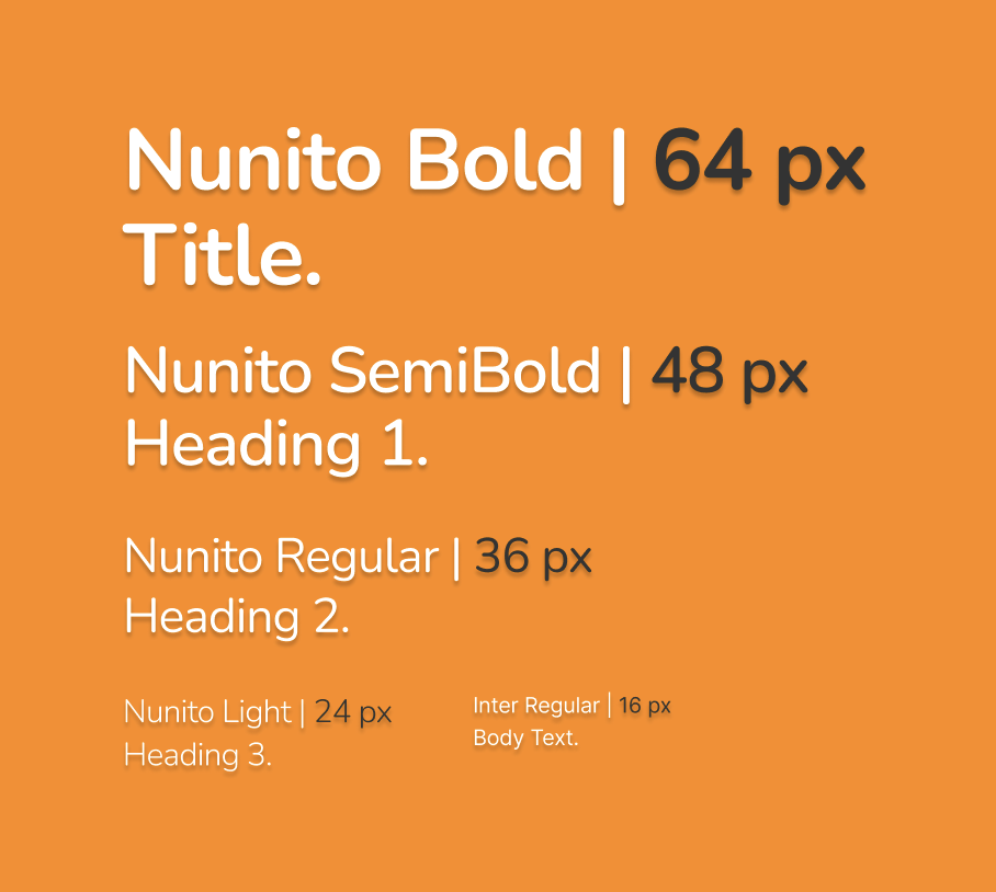
Rounded typefaces provide an aspect of friendliness and efficiency to their readers studies have shown in UI Design. Nunito and Inter evoke exactly that inviting and productive feeling users should feel with MarkIt.


Logo & Iconography
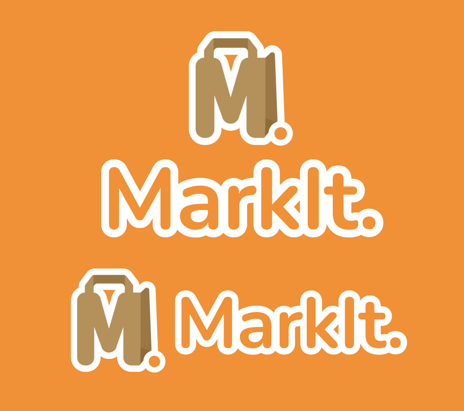
By adding a thick, stroke around the letters and icon, I was able to create a more friendly feel and less financial.
By adding tan to the icon, the paper grocery bag becomes more apparent and more on theme with grocery services.
The revised logo, type, colors, and iconography really promote that productive, used, inviting feeling I was ended up pivoting towards.
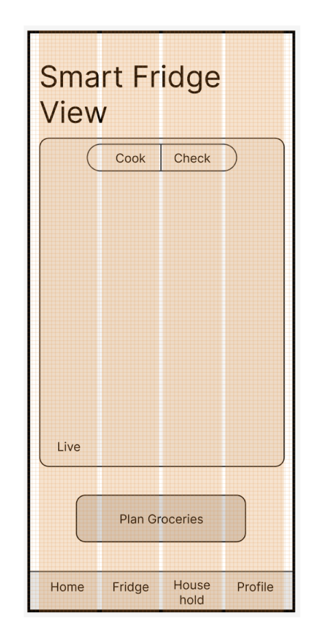
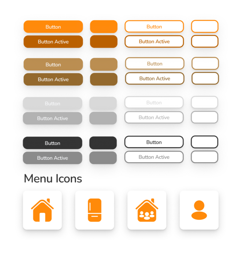
Similarly to the type, I wanted my icons and buttons to reflect a friendly and efficient tone. The rounded corners, simple designs, and use of orange communicate this tone well and invites the user to actually want to use the app.